30.11.12
12.11.12
Shagadelic weekend!
 |
| Me with Shag (A.K.A. Josh Agle)!!! |
 |
| Minotaur — Shag (2008) |
Anyway, when I met him this time, I got his newest book signed. But that's not all! I bought a print, 'Minotaur', and got that signed the back too. And because I felt like pushing my luck just a little further, I asked to take a photo with him as well! I was quite pleased with myself this time, I didn't turn into too much of a gibbering fan-girl. But I was smiling like a total jack-ass... (^_^)
IT WAS SUPER-AWESOME!!!
If you want to see more of his TOTALLY AWESOME work, check out his website!!!
9.11.12
Perpetual bliss
 |
| Small Perpetual Calendar (1998) — Gideon Dagan for MoMA store |
When I got to there, I saw the orange/silver one next to the red/black and all-silver ones. I had a tough decision to make. I really like orange, however the combination of red and black is always striking. I stood there staring at the two calendars for several minutes. I'm not even kidding.
Getting back to the point... Sometimes, what you want isn't really what you want. Over time one's taste evolves. In the end, the reason I chose the red/black one was that it looks very Bauhaus and cool — not to mention it goes well with the other things in my cubicle.
Also, the best thing about having a perpetual calendar is that I'll need to buy a desktop calendar ever again!
————————— COMING SOON —————————
I'll be doing a series of posts about Open House Perth.
Get ready for my best pictures of Perth Arena and other notable buildings from Perth's skyline!
After that, an awesome Photoshop Tutorial.
How to photoshop one person's face onto another person's body. With all the special tips and tricks I use to make it look more realistic!
23.9.12
Shin-Hanga: The softer side of Japan
.jpg) |
| Cherry and Castle — Yoshida Hiroshi (1939) |
After the decline of the Edo/Meiji period of Ukiyo-e woodblock prints, there came the inevitable revival in the early 20th century. This became the known as the Shin-Hanga (new print) period which flourished from 1915-1942, resuming briefly after WWII. They were designed to appeal to Western tastes giving a nostalgic, romanticised view of japan. And so, they were primarily exported overseas, never finding much fame at home. However, Shin-Hanga became immensely popular in America, so much so that there were two major exhibitions in the 30s.
What I like most about them is the warmer colour palates and how they're just less stuffy than Edo period prints. Not to say that Hokusai and Hiroshige prints aren't absolutely beautiful or that I don't love classic Japanese prints, but there's just something about Shin-Hanga that's just softer and hard to describe ― as lame as that sounds.
For more on Shin-Hanga visit: Wikipedia, Jacquesc, and artelino.
 |
| Misty Evening At Shinobazu Pond, Tokyo — Kasamatsu Shiro (1932) |
.jpg) |
| Sunset At Tomonotsu, Inland Sea — Tsuchiya Koitsu (1940) |
.jpg) |
| Ueno Shinobazu Pond — Tsuchiya Koitsu (1939) |
.jpg) |
| Heirinji Temple Bell — Yoshida Toshi (1951) |
.jpg) |
| Tengu Rock At Shiobara —Kawase Hasui (1950) |
.jpg) |
| Red Temple — Asano Takeji (1931) |
.jpg) |
| Evening Moon On Yodo River — Asano Takeji (1934) |
.jpg) |
| Heirinji Temple — Kasamatsu Shiro (1962) |
.jpg) | ||
Summer Moon At Miyajima — Tsuchiya Koitsu (1936)
|
10.9.12
Campbell's launches Andy Warhol soup cans!
 |
| Cans with label art from Andy Warhols "32 Campbell's Soup Cans" |
The only thing I'm not so pleased about is — after a bit of digging around — it looks as though they aren't available in Australia! But they're already on eBay...
Via The Cool Hunter, Grocery Headquarters, and Gizmodo.
19.8.12
Bernini at 25
 |
| Pluto and Proserpina — Bernini (1622) |
Italian master-sculptor, Gian Lorenzo Bernini, created Pluto and Proserpina at the age of 25! I can't even imagine how anyone in their 20s could have turned a giant lump of marble into something that brilliant. Apparently, when it was unveiled, they had to take precautions to protect it because people wouldn't stop touching the figure's skin. There are veins in Pluto's hands and indentations in Proserpina's thigh. The second image looks like a black and white photo. In fact, every sculpture that Bernini ever made is amazing!*
So why is this unsettling? I'm turning 25 next month! Puts things into perspective, doesn't it.
*In my opinion.
2.8.12
Getting to Nashville via Photoshop
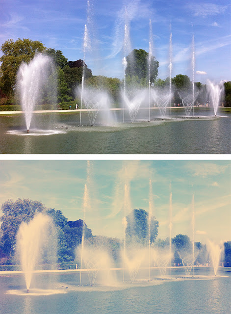 |
| The Musical Fountain at Versailles, from my trip to Paris!!! |
Instagram your images using Photoshop
1.8.12
Photoshopping like a Boss!
 |
| Abduzeedo Photoshop tutorials |
 |
| Get your Illustrator stuff lookin' grungy here! |
They even have Illustrator, Fireworks and Pixelmator tuts as well!
ABDUZEEDO!!!
3.7.12
Gustav says...
 |
| Gustav Klimt at his studio on Josefstaedter Strasse (Vienna, 1912). Picture: Moriz Naehr |
I've finally returned from my 8-week Serbian/European holiday. It was amazing and I didn't want to go home!!! On the way back to Perth, we stopped over in Vienna for two days. I managed to visit Gustav Klimt: Up Close and Personal at the Leopold Museum. It was forbidden to take photos but I found this interesting quote. I really like the way Klimt summed himself up.
 |
| The Golden Knight — Gustav Klimt (1903) |
“I can paint and I can draw. I believe this myself, and others say they believe this as well. But I am not sure it is true. Only two things are certain: 1. There is no self-portrait of me. I'm not interested in myself as a ‘subject for a painting’ but rather in others others, above all in females, and even more in other phenomena. I am convinced that as a person I am not particularly interesting. There is very little to see in me. I am a painter who paints every day from morning until night. Figures and landscapes, less often portraits. 2. I am not fluent in the spoken or written language, particularly if I have to express myself on my work. Even if I have to write a simple letter, I'm scared stiff — as if I were faced with seasickness. So there is no use waiting for an artistic self-portrait of myself. But this is no great loss. Anyone who wants to know anything about me as an artist — and this is the only thing that matters — should look attentively at my pictures and try to discern from them who I am and what I want.”
Gustav Klimt, undated typescript. Wienbibliothek im Rathaus
————————————— IN OTHER NEWS —————————————
I currently have NO INTERNET at home!!! So I won't be able to upload that many pictures or do any new posts any time soon. I'll figure something out as soon as possible. Before I go NUTS!!!
————————————— IN OTHER NEWS —————————————
I currently have NO INTERNET at home!!! So I won't be able to upload that many pictures or do any new posts any time soon. I'll figure something out as soon as possible. Before I go NUTS!!!
10.3.12
My favourite monkey
 |
| Simon Green A.K.A Bonobo |
Last night, I had the amazing privilege of watching Bonobo perform live at Capitol in Perth. He also brought Andreya Triana with him. She featured on a few tracks from Bonobo's latest album "Black Sands". I managed to squeeze myself into the mosh pit, right up the front. I was seriously less than 3m away from Bonobo and Adreya Triana! Luckily no one stepped on my (still) broken foot, even though I went without crutches. The concert was just brilliant and I had an AWESOME time.
I also got some really good photos with my iPhone. It's a shame I didn't have a proper camera though. Ah, why didn't I become a fancy photographer instead... Anyway afterwards, I asked one of the stage crew guys for a copy of the set list! And he gave me one! =D
 |
| Mike Lesirge who played sax, clarinet and flute! |
 |
| Andreya Triana. I know it's blurry but I like the colours. |
 |
| Simon Green rockin out! He's actually quite HOT in person! |
28.2.12
I know ALL the shortcuts!
So yesterday, I noticed my little shortcut sheets got pinned on Pinterest. Then re-pinned a few hundred times! Needless to say, I was quite thrilled. These sheets started as a bit of help for my office buddies from other departments who wanted to learn a little Photoshop and inDesign. Good skills to have in the newspaper industry. I had a little look around to see what other sheets were like and noticed that they either had way too many shortcuts to be concise and useful or were just ugly, so I made one with all the shortcuts I use daily that I've memorised over the years.
Since there was such overwhelming interest (200 hits in one day certainly counts as "overwhelming" to me), I made one for Illustrator to finish off the set! Anyway, thank you so much for visiting! I'm really glad everyone's finding them useful. \(^_^)/
Download the high-res PDF versions below:
DOWNLOAD ILLUSTRATOR SHORTCUTS!
DOWNLOAD PHOTOSHOP SHORTCUTS!
DOWNLOAD INDESIGN SHORTCUTS!
Also, check out my Pinterest page here!
————————— NEW! —————————
ALL NEW CS6 SHORTCUTS HERE!!!22.1.12
Pretty little flowers
 |
| How cool is this? And it's really easy to make too! |
 |
| Tulip instructions available here! |
I discovered something awesome the other day... Origami YouTube videos! I was very pleased. And I managed to make a Lotus flower, which is a lot easier than it looks. If you'd like to make one, you should start with paper that's 14cm x 7cm, rather than what the video suggests. Also, I made an extra layer of petals so it looks more full.
Don't have any nice paper? Not to worry. If you do a Google image search for Chiyogami paper and select "large" on the left, you can find some really nice patterns to print out at home.
18.1.12
Spomenik: Forgotten relics from a country that no longer exists
 |
| Kosmaj, Serbia |
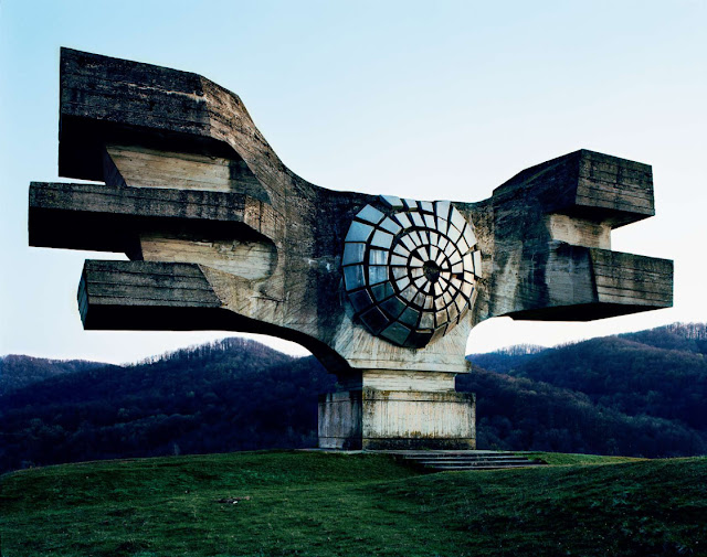 |
| Podgaric, Croatia |
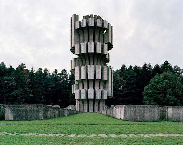 |
| Kozara, Bosnia and Herzegovina |
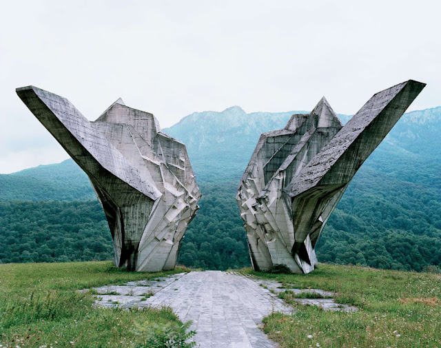 |
| Tjentiste, Bosnia and Herzegovina |
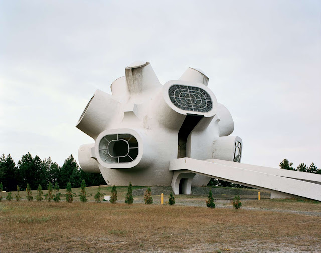 |
| Krusevo, Macedonia |
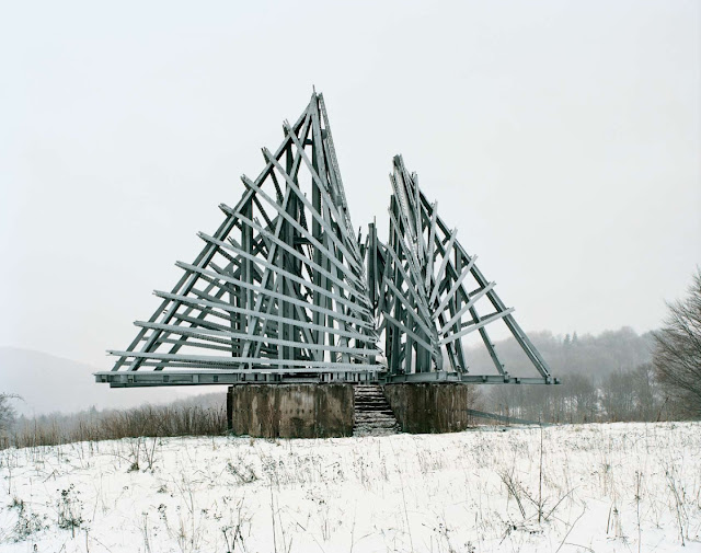 |
| Korenica, Croatia |
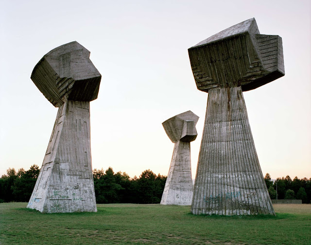 |
| Nis, Serbia |
Scattered across the former Yugoslavian countryside stand enormous Spomeniks. Long-abandoned WWII monuments built in the 60s–70s at historic locations. Millions came to visit these monolithic structures. However, after the demise of Yugoslavia, they were almost entirely forgotten and fell into disrepair.
A few years ago, Belgian photographer Jan Kempenaers toured the Balkans with an old map in search of these relics and here are a few pictures from his book (available from Amazon, already on my wish list).
They have such a strange other-worldly quality about them. Beautiful but sad. 'Beautiful' maybe isn't the right word. More like, they exude strength and must have demanded attention and respect. Now, they seem quite stark and ominous, protruding from the landscape like something that doesn't belong. Perhaps they always looked like that? Even after being abandoned, vandalised and stripped of their meaning, they're still magnificent, if only from a sculptural perspective.
I've gone back to Serbia a few times since we moved to Perth, but I haven't had a chance to do much more than visit relatives. Next time, I'll make sure I see at least one Spomenik!
For more info and images, visit Crack Two, Trendland and ISO50.
4.1.12
I know another shortcut!
 |
| It might look blurry, but it's not! Download the high-res version below!!! |
One of my esteemed colleagues from another department showed interest in learning inDesign. So I made this little cheat sheet to help.
CLICK HERE TO DOWNLOAD A HIGH-RES PDF VERSION!
I also made one for Photoshop a few months ago, you can download it here. Sorry, macs only!
CLICK HERE FOR PHOTOSHOP AND ILLUSTRATOR SHORTCUTS!!!
————————— NEW! —————————
ALL NEW CS6 SHORTCUTS HERE!!!
Subscribe to:
Comments (Atom)


